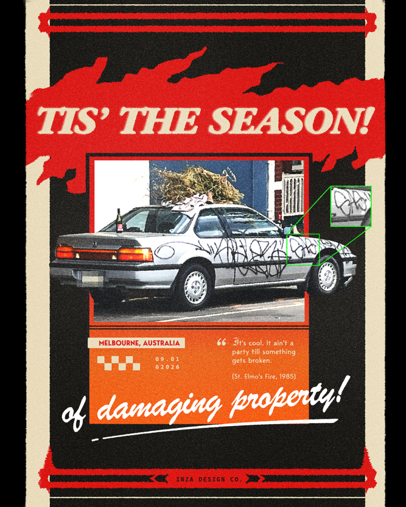
This quote from the movie ‘St. Elmo’s Fire’ ,1985 was literally stuck in my head since I heard it on Andrew Huberman’s podcast with David Choe, and it just flashed in my mind when I saw this scene:
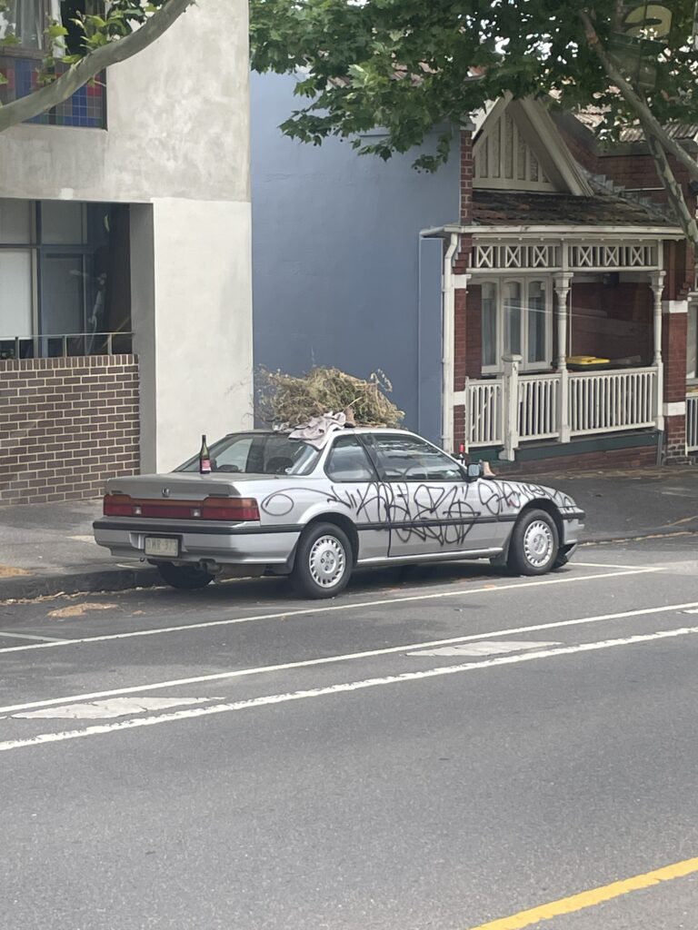
The timing was perfect. I shot it from a tram window on an early summer morning in the first week of January. The context just made sense. It was the perfect amount of chaos I needed to make it into a poster.
Early Thoughts:
- It was pretty clear from early on that this poster was going to have a satarical vibe to it. At first, I was heavily leaning towards making something that screams, “2025 was the worst! I am glad it’s over!!” (It was a pretty though year to be honest).
- Then I thought about giving it the survellience aestheic look:

- Later I researched a bit about the car. It was a Honda Prelude produced between 1987 and 1991. I instantly knew that I want to give it a very 80’s retro racing poster look.
The Poster
Notes
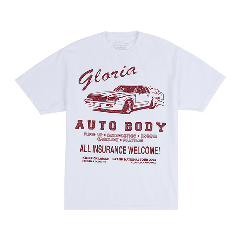
I have used more than five fonts in this poster! Using Futura and Garamond for a 80’s look was a no-brainer. The hand written font is actually inspired from the graphics of the Kendrick Lamar concert I attended last month:
Overall, I wanted the poster to look and feel GANGSTA with sinister overtones. I am pretty happy with how it turned out.
Inza Galaxies | A Car Tray
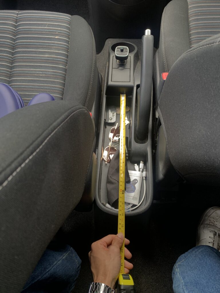
I am trying to make a 3D printed tray for my car. My plan is to have a tissue paper dispensing system and a small bin to dispose those tissues. It should also have something I can store fuel reciepts in and a place to store coins and probably sunglasses. Let’s see how much of this is possible.
Progress till now
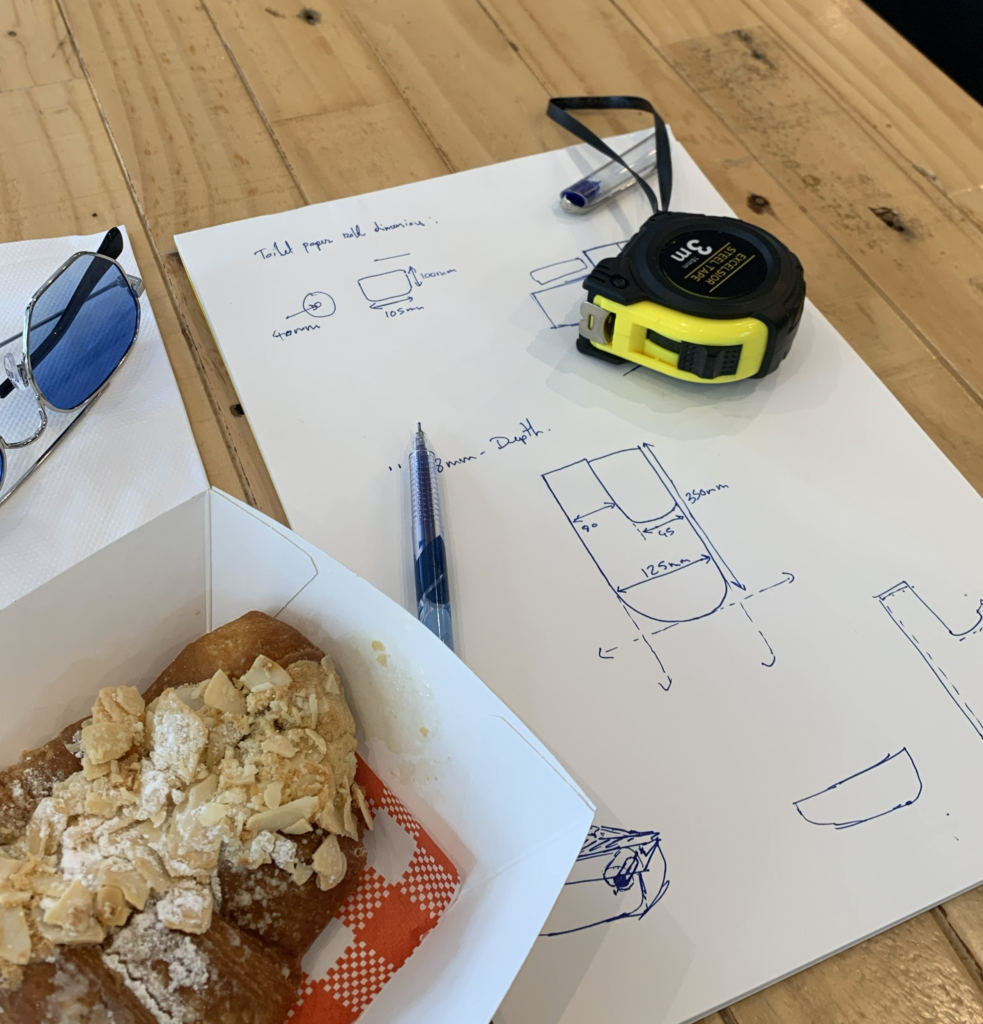
- The measurements: I got most of the measurements but I just cannot figure out how to measure the rounded edge.
- Setting up tools: I have finally understood that Blender 3D has its limitations and is not suitable for designing CAD heavy stuff. Thankully, one of my friend was kind enough to lend me her SolidWorks licence. So, I am setting up my file there (I just have to figure out how to actually use that software now and that might take a while).
The Observable Universe
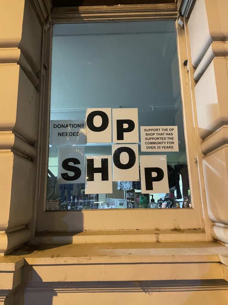
Saw this yesterday as I was walking home. The arrangement of the letters is so well thought of! It’s feels like a very grotesk version of Emil Ruder’s style of design.
The Unknown
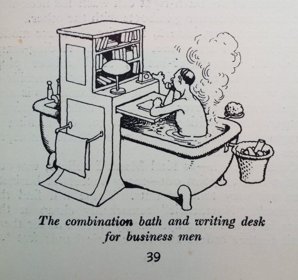
Came across the work of cartoonist W. Heath Robinson. I found some pages of his book ‘How to Live in a Flat’, and it’s a work of a genius. Definitely a huge inspiration for my future projects.
Thank you for reading! See you next week.