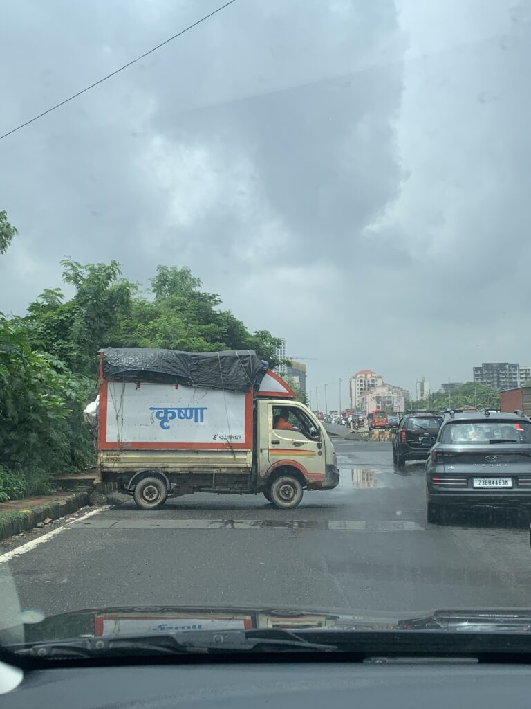
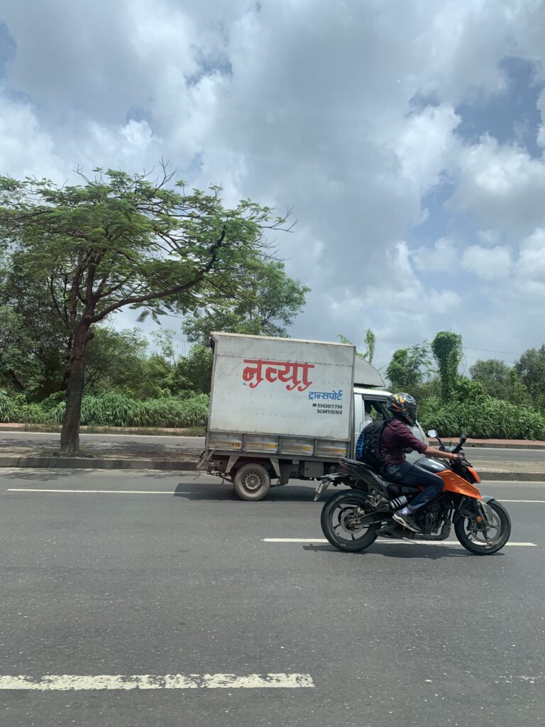
The dreadful wait at a bus-stop rarely is a boring phenomenon for me. I marvel at the massive chunks of engineering that dominate the single lane road in front of me. Of cource, this is the time where my creative identity as a research practitioner (more on this later) takes over and I start to capture things on my tiny iphone 12 mini:
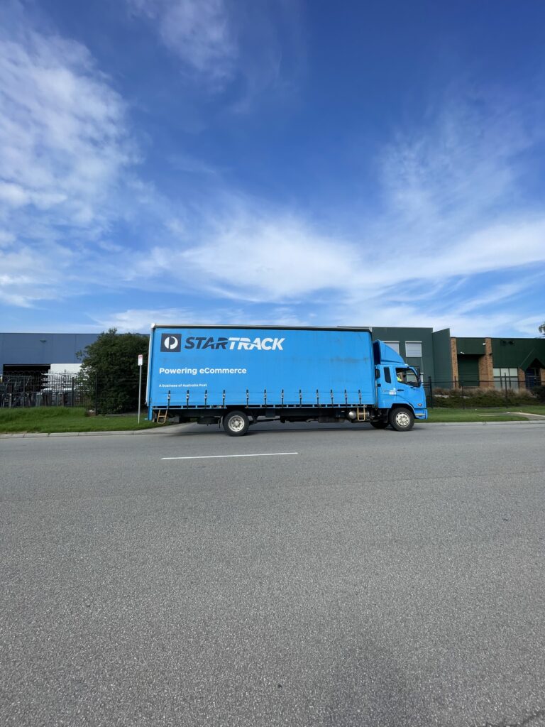
The bright blue sky with the bright blue truck in the foreground, awkward flat orthographic type view, speaks heavily to the artist in me. In hindsight as I write this, it strangely reminds me of Carl Sagan – Pale Blue Dot (probably because of Artemis II rabitholes I am exploring lately)!
The Poster
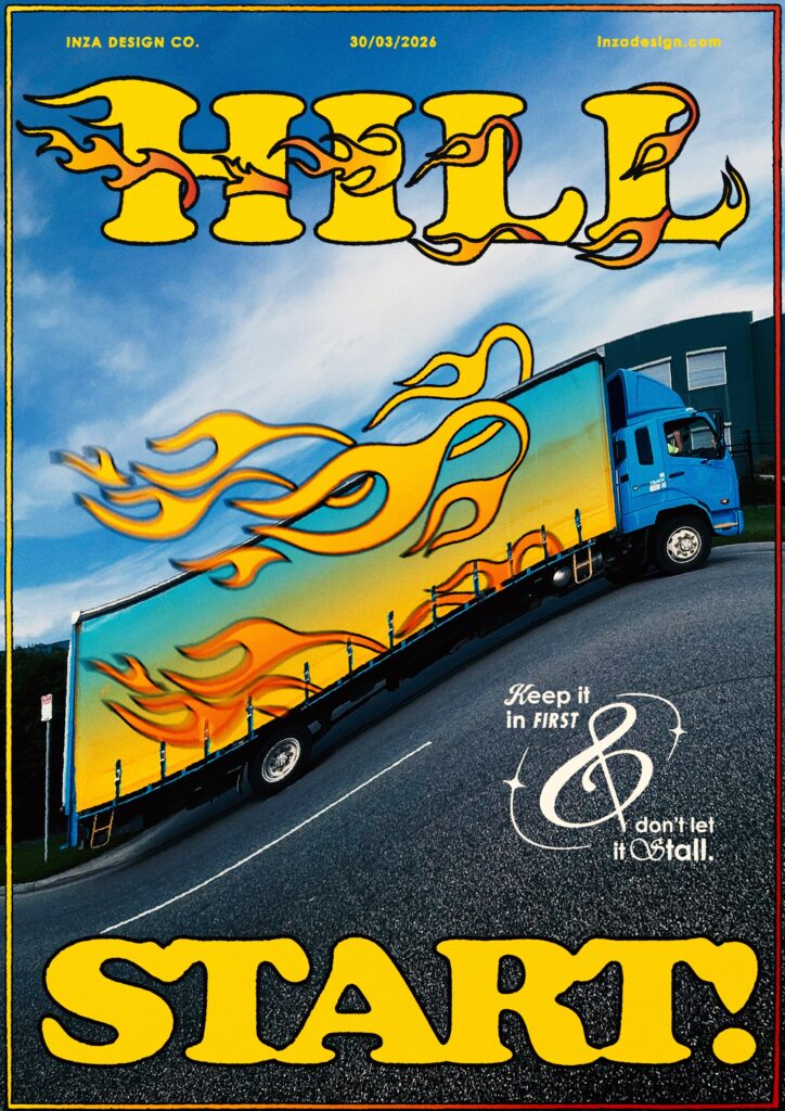
At first, I really wanted to focus on the blues and play it safe. But then I decided to take a bolder, brighter and wilder stance.
Warping the photo, added drama. It was a great starting point. It transformed the flat road into a hill and gave notions of a ‘hill start’.
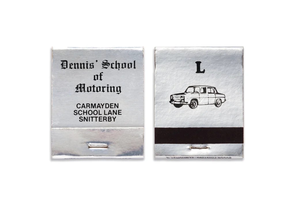
Then with RGB Yellow and Cooper Black font (design decision inspired from Dennis School of Motoring‘s matchbook design), the poster started to look, as your clients would always want your designs to be – POPPY.
Using the flow of the truck, I added flames! and more flames! everywhere.
Fun Fact: The design element on the bottom right uses 5 fonts in itself! It was inspired from the beautiful work of Annie Atkins, especially her Manifesto for working under pressure.
Inza Galaxies : Auto Devanagari
I want to create a font in devanagri font which would be used and inspired by the transport industry in east asia. It coud be grotesk or one could typeset a book in it. I don’t know this at the moment. Right now, I am thinking that it would be a somewhat devanagri version of ‘Serpentine‘, but this may change overtime.
Some inspiration:
This project has several challenges. The first being that I am not a qualified type designer and I have zero experience in designing a font.
To get a better understanding of designing a devanagari typeface, I reached out to Janhavi Nikharge to talk about her project ‘Loco Devanagari‘ which I have always been a fan of. In my next newsletter, I will talk about how it went.
The Observable Universe
These series of observations are titled: ‘Great typography emerges from the earth’.
The Unknown
‘Your Research Practice Is Your Creative Identity‘ by Zoë Yasemin was a very interesting read. She says,
Research is when the act of looking starts producing ideas. You are making connections across unrelated fields, noticing patterns, and building a visual argument. You find a photograph in a 1970s Italian architecture magazine, and it changes how you think about negative space on a brief you’ve been stuck on for two weeks.
I couldn’t help but thinking of my practice of ‘image-making’ as a research practice. I have always followed a very similar process while making these posters but the graphic treatment varies all the time. I have had a very hard time understanding what’s ‘my style’ (or creative identity in this context). But maybe, this ‘research practice’ of looking and capturing things in a certain way is my creative identity. It has definitely helped me make connections across unrelated fields and make creative breakthroughs.
Thanks for reading! I am off to watching Nasa’s livestream of Artemis II (literal goosebumps, btw).